ASCII Kit
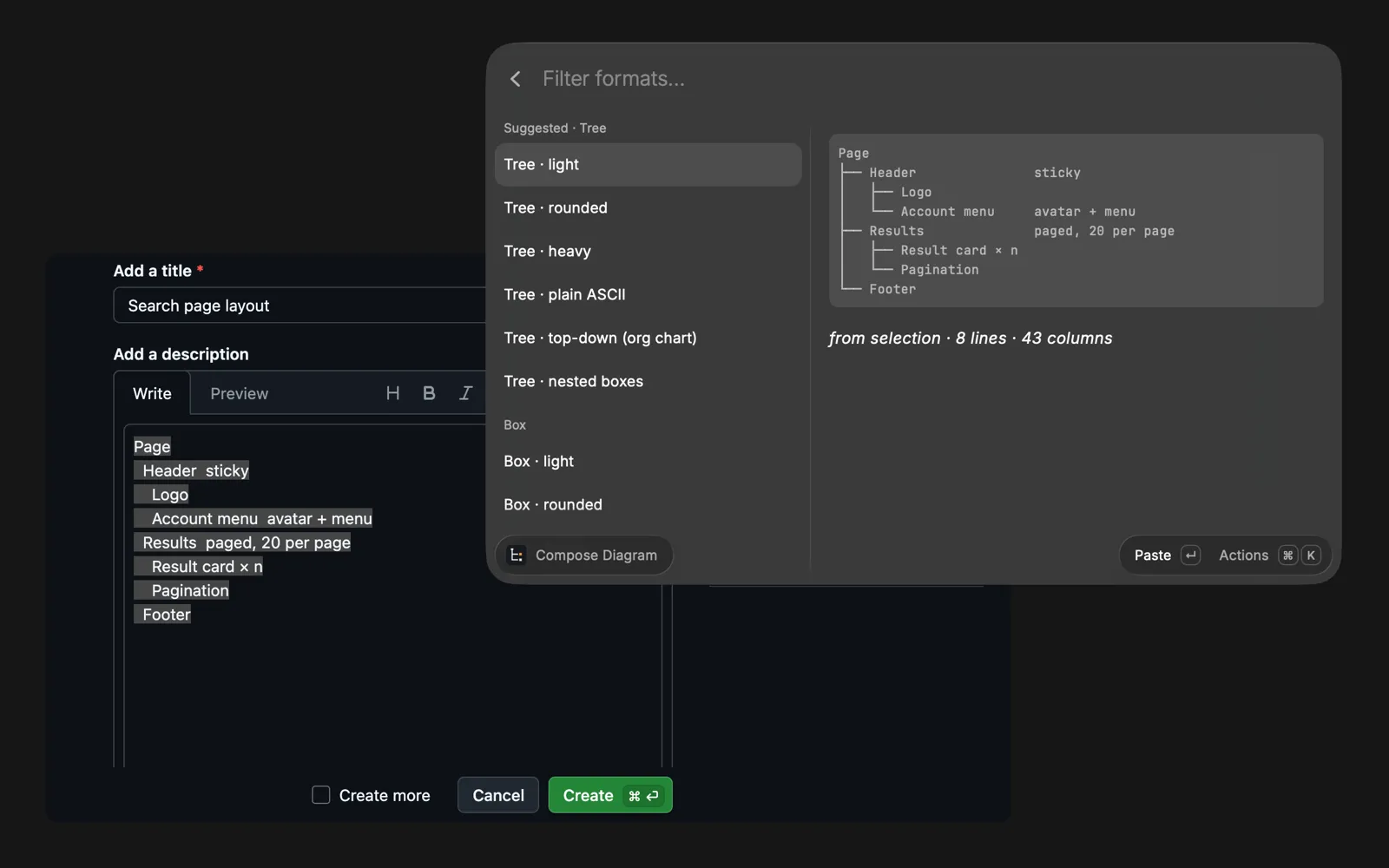
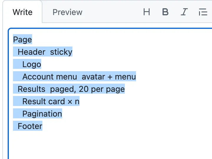
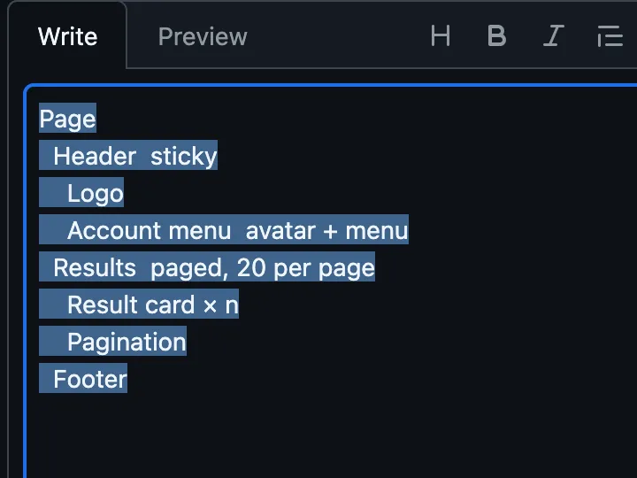
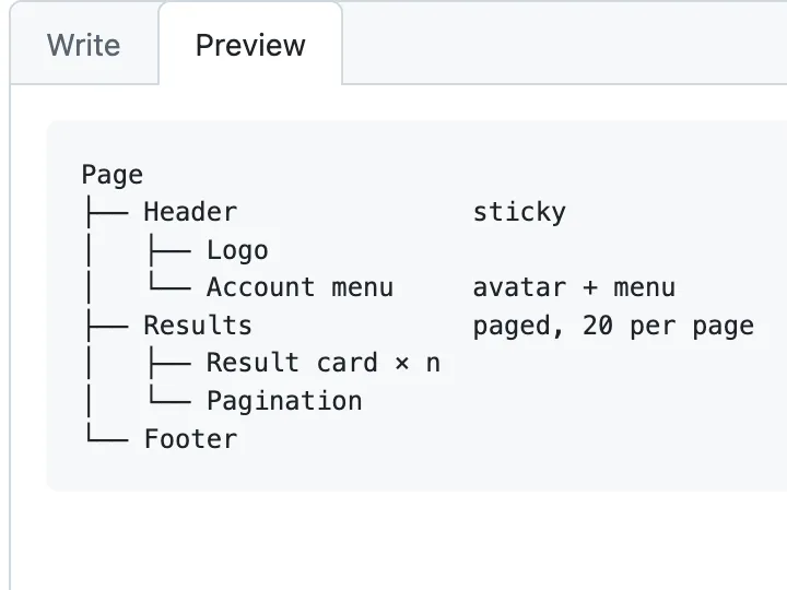
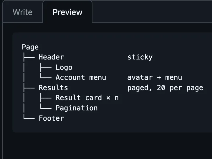
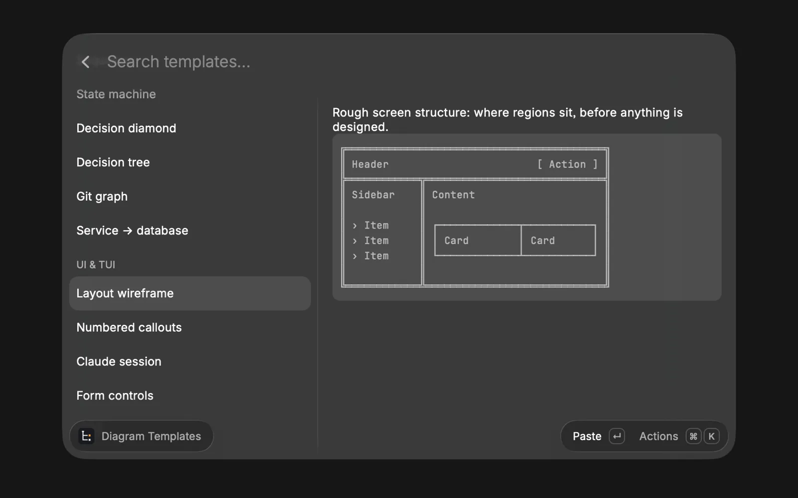
ASCII Kit is a small Raycast extension for text diagrams. I select some plain text, press a hotkey and pick a format from a live preview, and the text becomes a tree, a table, a flow, a sequence diagram or a chart that stays lined up when I paste it into a pull request, an issue tracker or any other tool that supports monospace formatting. It also has a searchable glyph palette, templates to start from, and snippets for the glyphs I type most often. An indented list, for example, becomes a tree. For when formatting isn’t enough and a drawing is too much.
Page                   Page
  Header  sticky       ├── Header            sticky
    Logo               │   ├── Logo
    Account menu   →   │   ╰── Account menu
  Results  paged       ╰── Results           paged
    Result card            ├── Result card
    Pagination             ╰── Pagination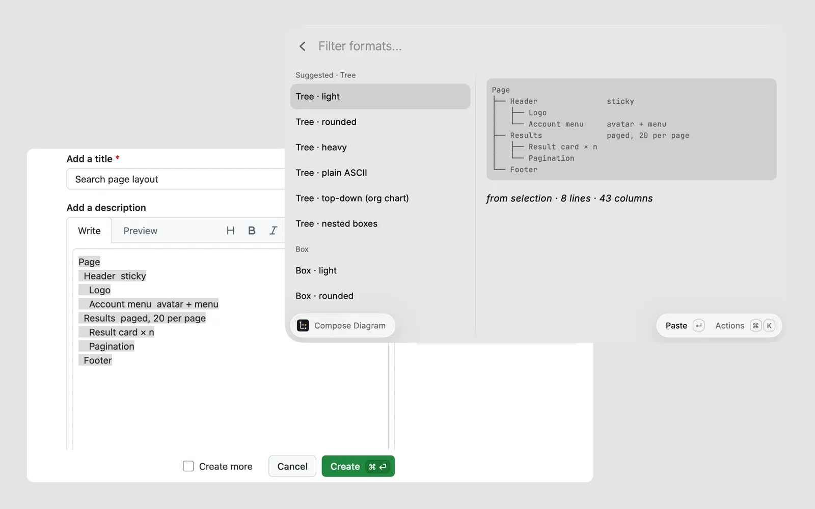
Where it came from
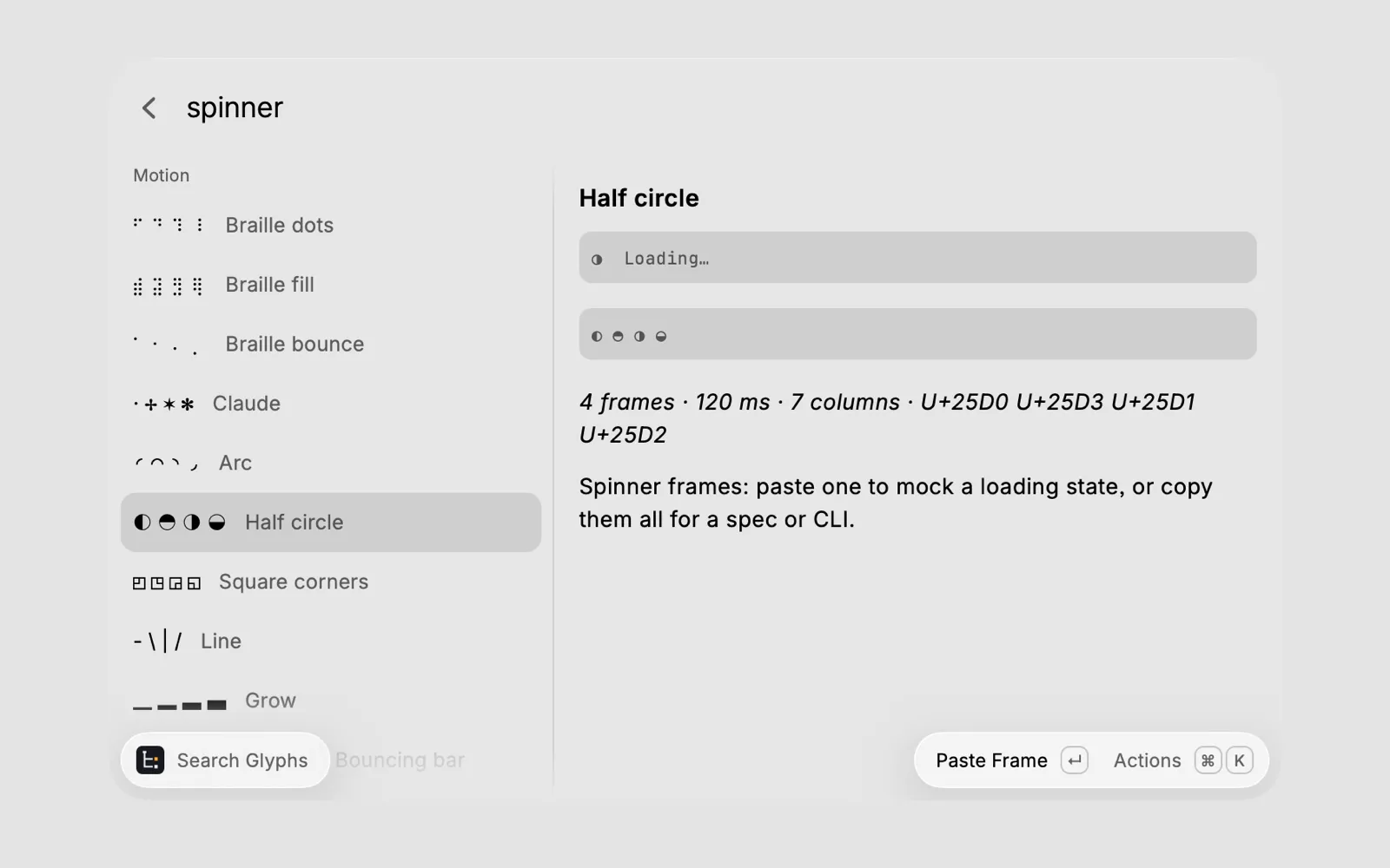
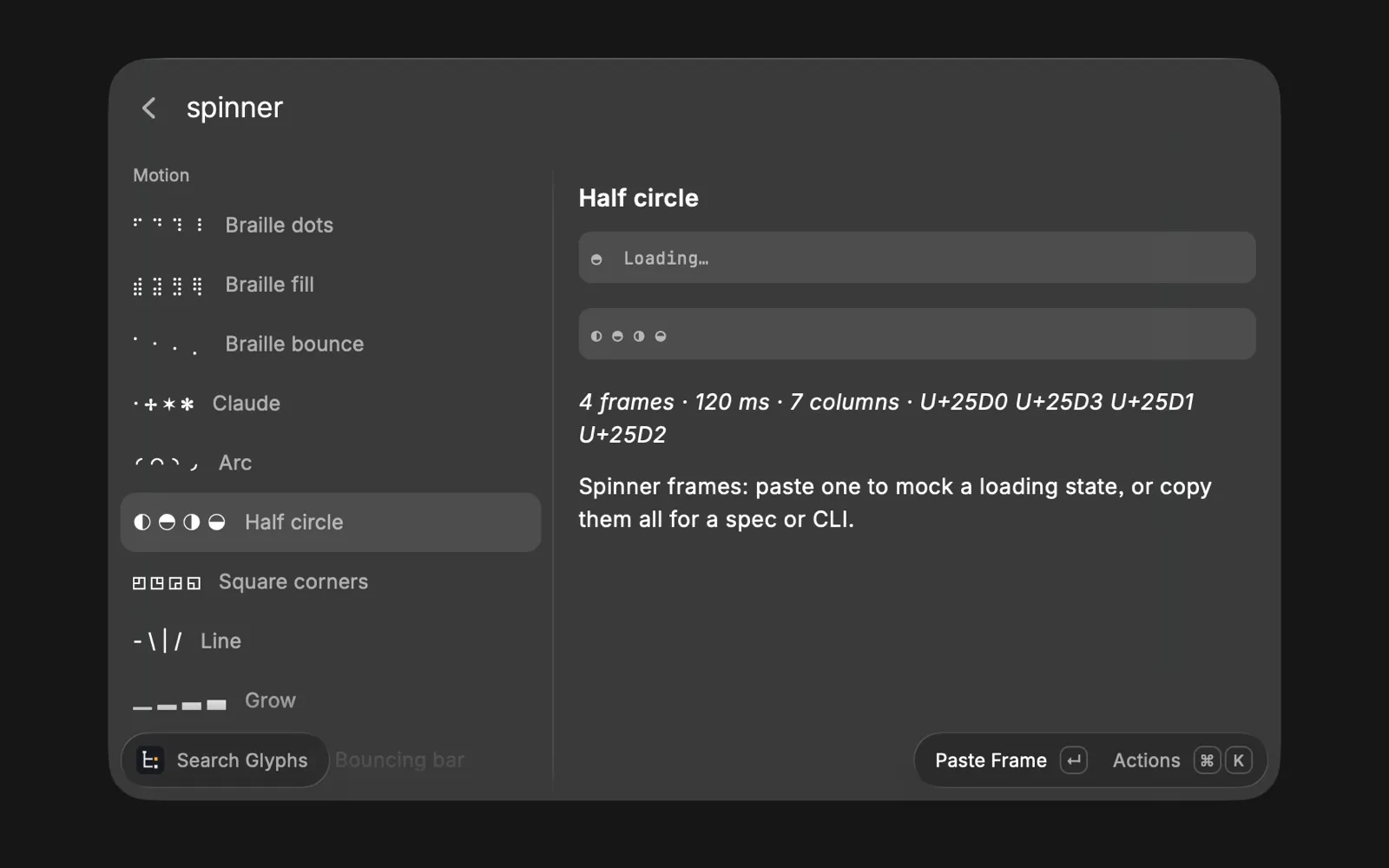
I’ve liked terminal UIs for a long time. For years I’ve kept snippets in Alfred, and later in Raycast, for single glyphs like • → ○ ◐ that liven up a Slack message or a PR comment. Then I spent a lot of hours in Claude Code, whose option dialogs are drawn in plain text, and that was the last push. I wanted something between simple formatting like bold and bullet points and opening Figma to draw three boxes and an arrow. I built it for myself, and if someone else finds it useful as part of their toolkit, even better.
Design in a tight space
What draws me to TUIs is the feeling of a command-line tool with an intuitive flow and an elegant look, like the ones that guide a new project’s setup step by step, Astro’s among them. The usual design principles all apply in a terminal, with a twist. It’s keyboard first. State and status have to be clear in very little space. Accessibility still matters, and people’s own colour themes change how a status indicator looks. Undo and moving between steps have to keep the state clear, and the layout has to be responsive without clear breakpoints.
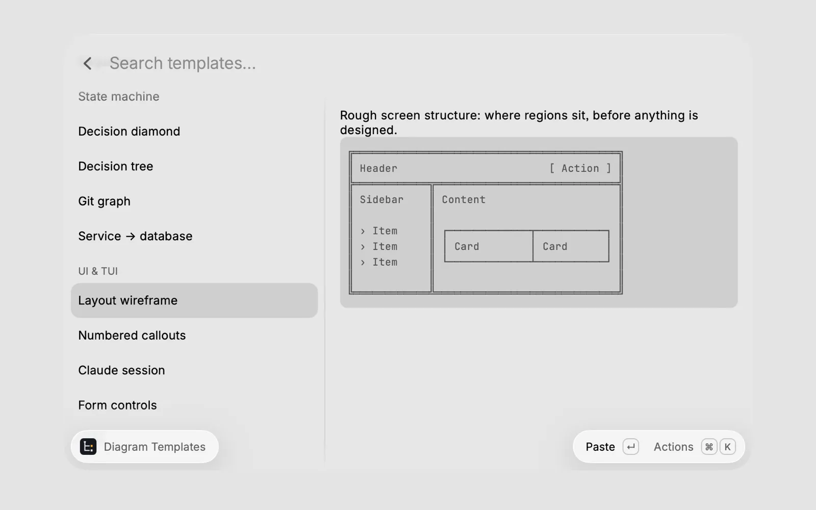
ASCII Kit has its share of those twists. Raycast’s preview wraps code blocks at about 56
columns, which I noticed while testing, so every template now fits within that. Some symbols,
such as ⚠ and ✔, are one column wide in one app and two in another, which is enough to break
the alignment of a whole diagram, so the kit flags them and its diagrams use safer ones. And a
toggle drawn as a line with a dot read as a slider, so toggles became pill shapes, like
( ●).
Simple on purpose
ASCII Kit is for quick diagrams in a message or a comment. For documentation meant to last, an image still carries more detail, and plenty of tools, any AI agent included, can draw a diagram from a prompt. I knew from the start how strict the limits of text diagrams are, so I kept to simple ones. Anything packed with information, such as a big org chart, a complex flow chart or a user journey, doesn’t work with a few words inside boxes, even when a template for it could be made to look good.
How it was built
I made the product decisions, from the formats Compose offers to the glyphs and templates that made it in. Some were my ideas from the start, and others began as Claude’s suggestions that I accepted. Claude handled the technical side, such as parsing plain text into diagrams, which takes a lot of regular expressions.
Complexity kicks in quickly. A line like Design > Build > Ship is clearly a flow, but
Storage > 5GB is a comparison, and HD > 4K > 8K is a flow again. The Raycast Store review
comes in phases, with automated reviewers first and then a person, and each round turned up
more cases like these. I couldn’t have got past those hurdles without technical help, and the
review felt smooth mostly because Claude handled the bulk of it with me. For me that’s the
best part of working this way. An idea that would otherwise have stayed on the drawing table,
because building it was the bottleneck, can now be made.
Status
ASCII Kit is in the Raycast Store. It’s free and open source under the MIT licence, and the code is on GitHub. It was a nice project to learn from, and I hope to make more side projects like it, big and small, when I have the time and new ideas.